Many Red Sox fans enjoy the experience of being at a game in Fenway Park; they like to soak up the atmosphere with other fans in a historical venue. But no experience is perfect; there are always downtimes and inconveniences during a ball game.
How can we create a digital ballpark experience that complements real life? 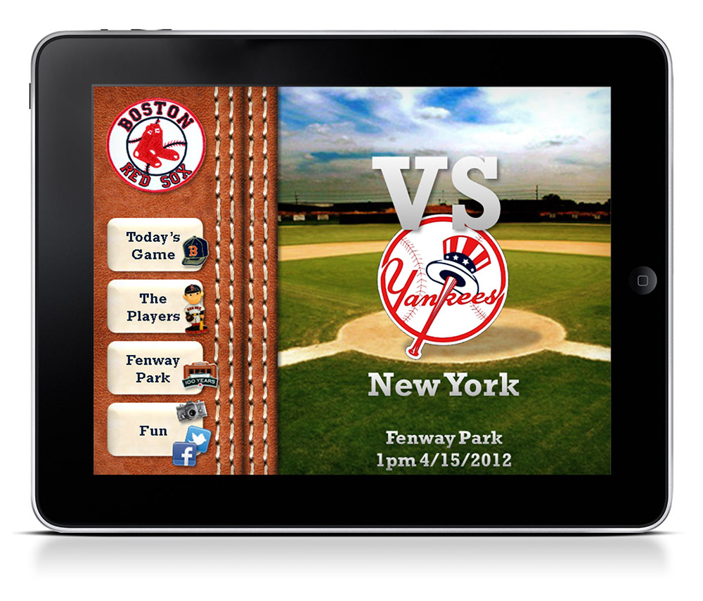
In this student work, we were tasked with creating an iPad app that a Red Sox fan could bring to the game. It had to have a comprehensive set of features and great visuals.
Research
To find out what makes a great baseball game, we turned to baseball fans. We conducted informal interviews with fans we knew, and I helped design and implement an online questionnaire that went out to our friends and members of online baseball forums.
We found the following issues:
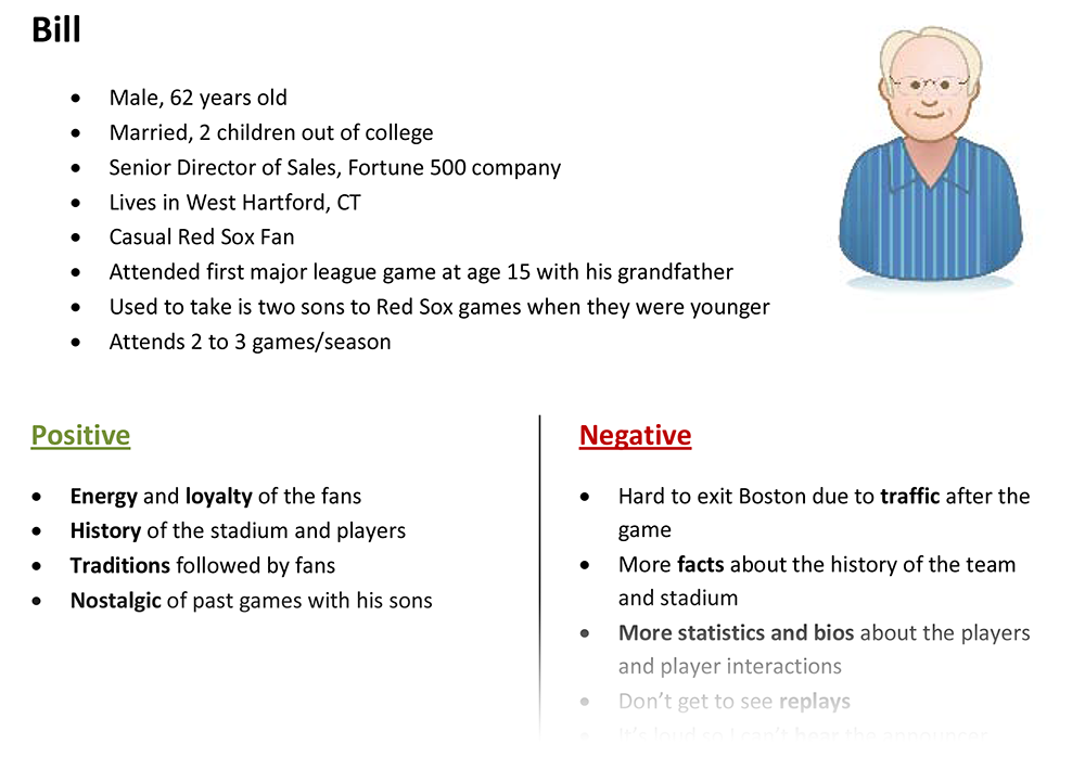
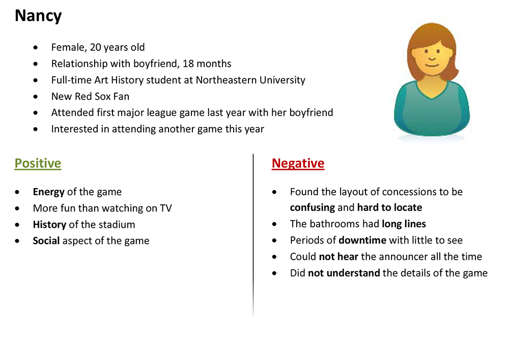
- Red Sox fans young and old have fond childhood memories of being at baseball games, and appreciate the history of Fenway Park.
- There is a place for quick, accurate player statistics, especially when discussing the players currently at bat.
- Food and toilet breaks are logistical necessities, but some people don’t want to miss the action.
Thus, we decided to create a tablet application that provides the following:
- Instant statistics for both new and veteran fans
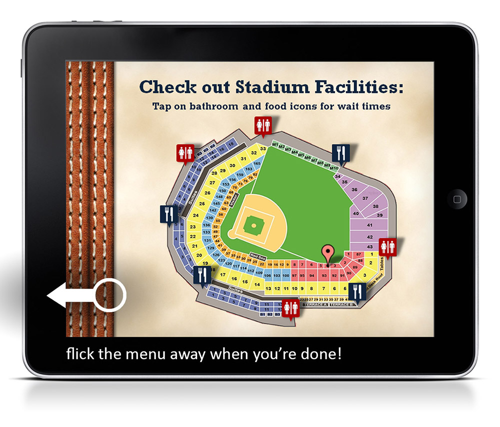
- Information on ballpark history, facilities and services
- In-app food purchase and delivery to the seat
- An unobtrusive interface that invokes the nostalgia of Fenway Park
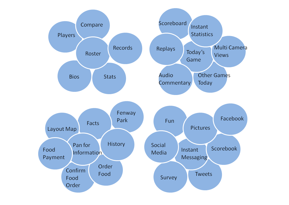
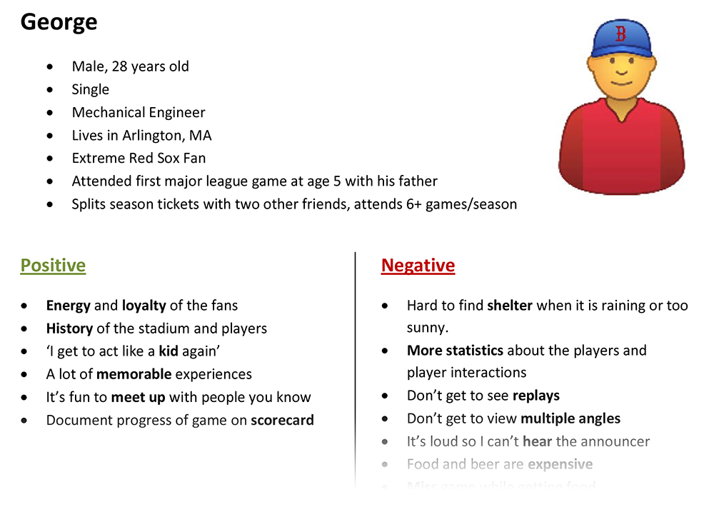
As a group, we worked on the app’s information architecture, making sure to present a wide range of functions meaningfully. Based on the people we interviewed, we created personas to tell general user stories. We also generated a list of concrete, testable usability requirements.
My contributions:
1. I created an online questionnaire to research current tablet use patterns at the ballpark and analyzed the results. (Find it here.)
I first asked: what questions am I trying to answer with this tool? We needed to find out how people used their mobile devices before, during and after a game; in other words, their mobile use patterns. In addition, we needed to know what information people wanted before, during and after a game. Only then can we know and choose the specific needs that our app will meet.
After extensive research, we decided to focus on meeting the various needs that arise during a game. This was instrumental in the selection of our design direction.
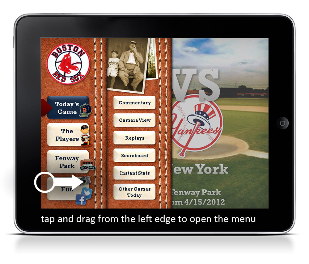
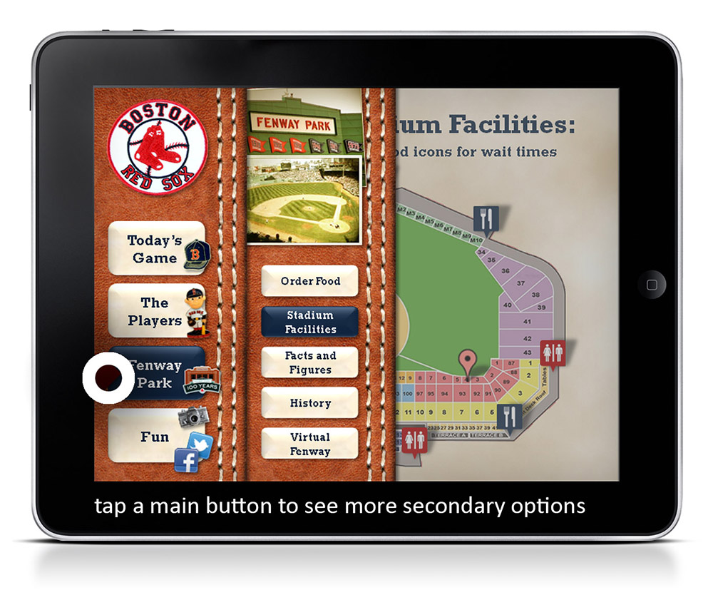
2. I designed a top-level navigation system that facilitated immersion and conveyed the history of Fenway Park.
The design brief required that our app include a large number of functions. Yet, given the tablet’s limited real estate, we needed a space-saving navigation system. At the same time, the interface had to have a nostalgic aesthetic – so lots of old photographs, memorabilia and the like.
The final solution made use of a hide-away menu that can be swiped into and out of view. It’s helpful when you need it, and goes away when you don’t.
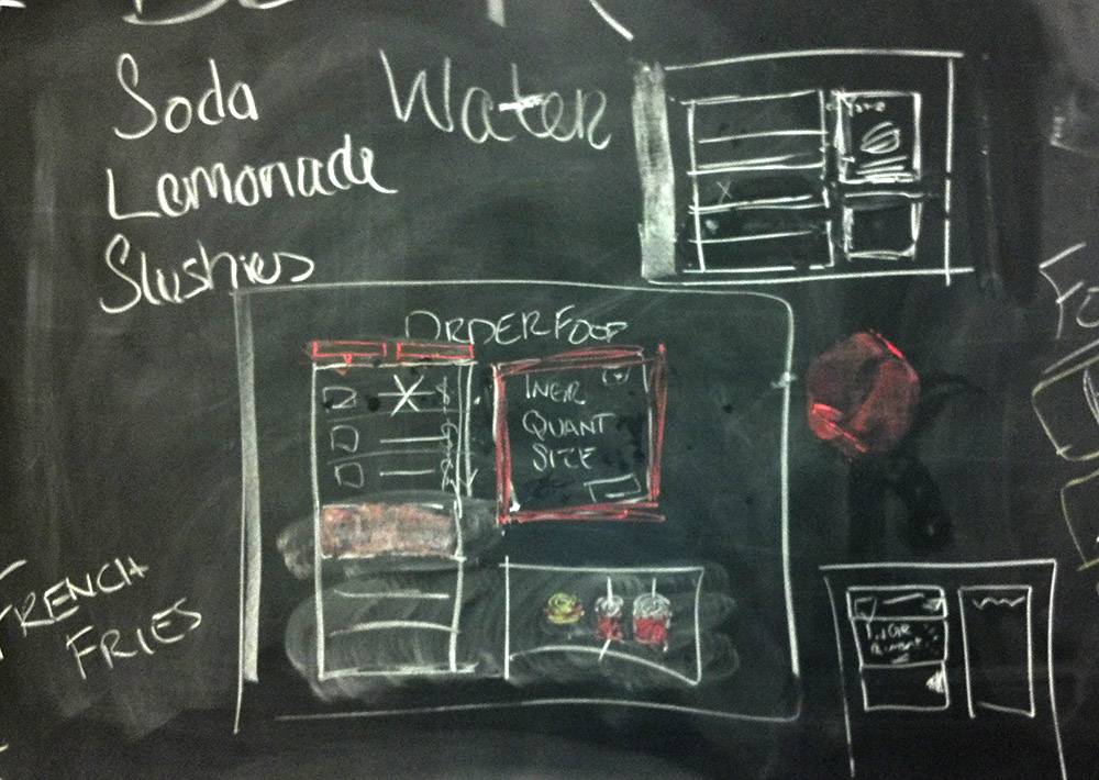
3. I was responsible for the visual aesthetics of the app and helped put together an interactive prototype for testing and demonstration.
I created most of the visual assets in the app using Photoshop and Fireworks, and put together an interactive prototype that showed significant functionality. It was executed in PowerPoint, of high visual fidelity and medium functional fidelity, and was used for testing and demonstrating the concept. Download the prototype here.
4. I conducted a thorough usability test with the prototype and gathered feedback.
My team mates and I conducted usability tests with Red Sox fans of all ages and levels of fanaticism. We prepared a list of common goals and asked participants to accomplish them using the app. We found the following:
- The navigation system was easily understood, though the layout of some individual screens did not fully make use of a tablet’s touchscreen capabilities. (Unfortunately, we could not test the prototype using a touchscreen device.)
- The presentation of certain baseball statistics needed more work. Hardcore fans know what ERA or SHO means, but a newbie doesn’t; how do we reconcile their needs? Future work should take this into account.
Credits
The design was developed with Katarina Morowsky, Chris Proulx and Kristen Ford at Tufts University.
Gesturcons by Ron George.
Contact Me