Mobile technology has improved by leaps and bounds, but blood donation is still an archaic process in many places. Donors must still fill out paper forms, and their information is kept track of using legacy systems.
How can technology streamline the way we donate blood?
In this student project, we were to design an iPad app for the Red Cross that can be integrated into the current blood donation process.
Research and Insights
I conducted a literature review of past research and studied Red Cross materials. I wanted to find out more about the people who donate blood, and to better understand the process and goals of blood donation from various points of view.
I also interviewed a blood drive coordinator at Tufts University to get a first-hand account.
I discovered the following:
- The most valuable blood donors are repeat or “multigallon” donors; they contribute the most blood.
- Repeat donors tend to be older; their mean age is 52 years old compared to the 38 years of all donors1.
- Typically, if a first time donor is temporarily deferred, most likely s/he will never return.
- The Red Cross needs to diversify the blood donor pool to ensure a similarly diverse range of blood types.
These led to the following insights:
- Whatever technological solution is implemented must be usable among the elderly.
- Filling in the blood donation questionnaire – the most tedious step – should be quick and easy.
- The app must be inclusive of people whose first language is not English.
Usability Goals and Personas
Given these interests, I created a list of testable, concrete usability goals. Though I did not have the opportunity to confirm these tests after designing the app, they made my design goals more concrete. For example,
Blood donors above the age of 50 will rate the usability of the tablet interface incorporated in the blood donation process as very high (an average of >5 on a scale from 1 to 7).
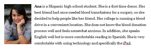
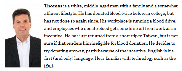
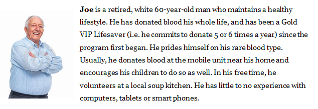
I created three personas whose stories embody the different backgrounds and motivations of blood donors. They reminded me who I was designing for.
Information Architecture
Given the constraints, I brainstormed a list of functions and picked the most relevant. I grouped related functions in a conceptual model diagram (aka a bubble diagram). With that as a basis, I created a user interface structure showing the different screens and how a user can navigate through them.


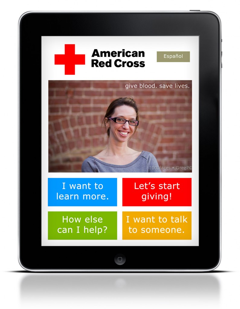
Screens and Prototype
To illustrate the look and feel of the system, I created a number of high fidelity screens. The visual design is based on the Red Cross’ blood donation web site (and to some extent had a proto-Windows 8 feel!).
Here are some sample screens:
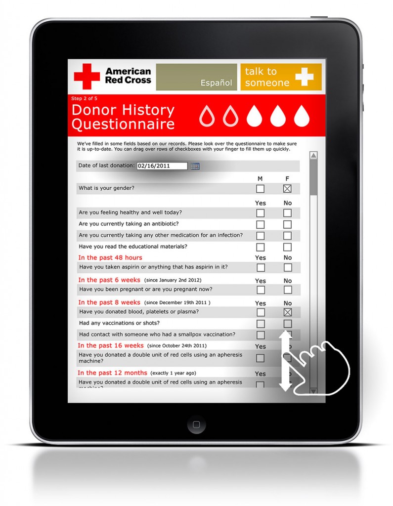
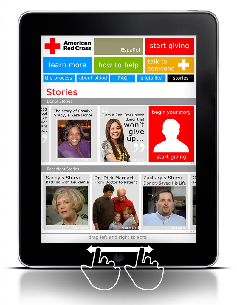
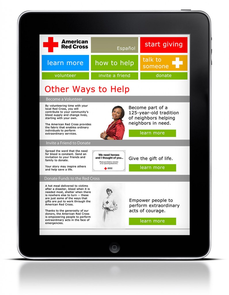
Essentially, the solution addresses the design problems in the following way:
- Bold colors, big buttons, clear navigation, touch-centric interactions – I have tried to incorporate all this and more to keep the app usable.
- Where tedium can be reduced, I have – such as by letting repeat donors log in and automatically filling in certain fields (birth date and gender, for instance).
- Different language options – here, Spanish – are always available.
Click here to view an interactive Flash prototype. (For best viewing, I suggest right-clicking the link and selecting “Save Link As…”) Use the left and right arrows for horizontal scrolling.
Outcome
I presented my design rationale and prototype to my classmates and my instructors, Michael Wiklund and Jonathan Kendler, as well as their colleague Daniel Wong at Wiklund R&D. They provided me with valuable feedback on the design, as well as my presentation.
Lessons Learnt
Despite the high visual fidelity of the prototype, I still view this as very much a work in progress. Some things to keep in mind:
- Make sure that top-level functions are unambiguous and non-overlapping.
- Keep the information density of each page low! Preview a screen on a real tablet if necessary.
- Keep the personas in mind at every stage of the design process.
Notes & Credits
1. Gillespie, T. W., & Hillyer, C. D. (2002). Blood donors and factors impacting the blood donation decision.Transfusion Medicine Reviews, 16(2), 115-130.
Gesture icons by LukeW.
Contact Me