In this student work, we helped the Tufts Center for Engineering Education of Outreach (CEEO) develop the information architecture of a K-12 education software.
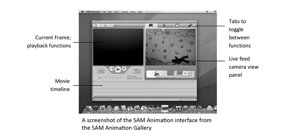
The Tufts CEEO had previously developed two excellent pieces of educational software: RoboBooks and SAM Animation.
RoboBooks is a digital workbook program that facilitates multimodal learning. Students can respond to quizzes through writing, drawings or speech, and have access to mindmaps.
SAM Animation is software for making stop-motion animation quickly and easily, with intended applications in education.
CEEO asked: why not allow students respond to quizzes using animation? They approached us with the task of expanding RoboBooks’ capabilities to include SAM Animation’s unique animation-making techniques.
Project Requirements
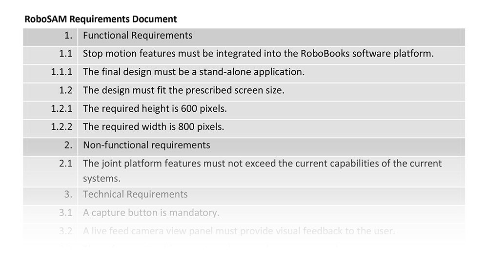
I first reviewed the programs to familiarize myself with the interface of these two programs. I also received the following set of technical requirements for creating this hybrid program, RoboSAM. As I worked on the redesign, I checked back periodically to make sure that I adhered to all of them.
Digital Archeology: Digging Through Old Software
I first created a diagram depicting the existing user interface structure of the workbook in RoboBooks, showing the program’s navigation.
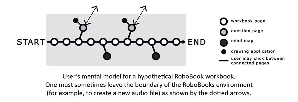
During the design process, I thought about the following points:
- Making the interface “shallower” to reduce working memory load, even while increasing the number of features available
- Integrating RoboSAM into a standard classroom by considering teachers’ time and resources
Design Solution
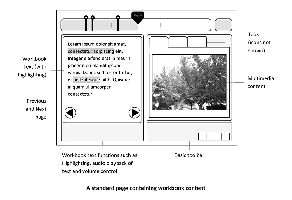
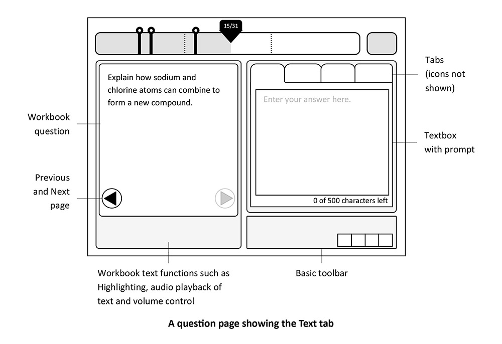
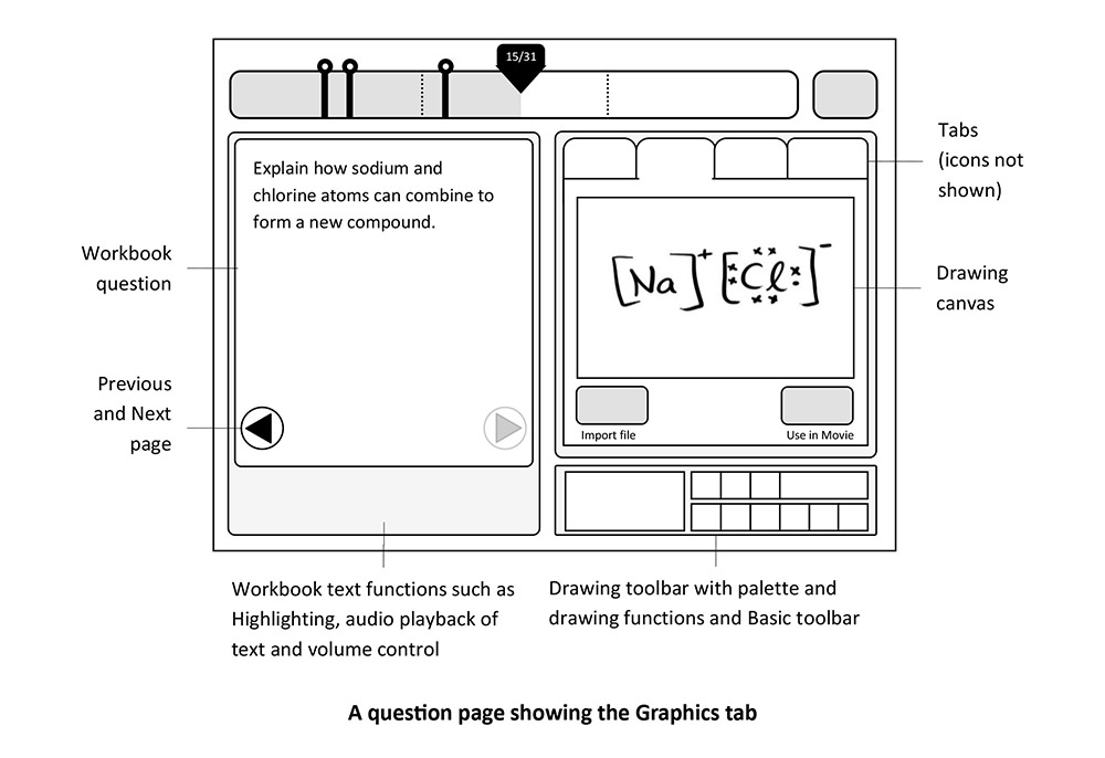
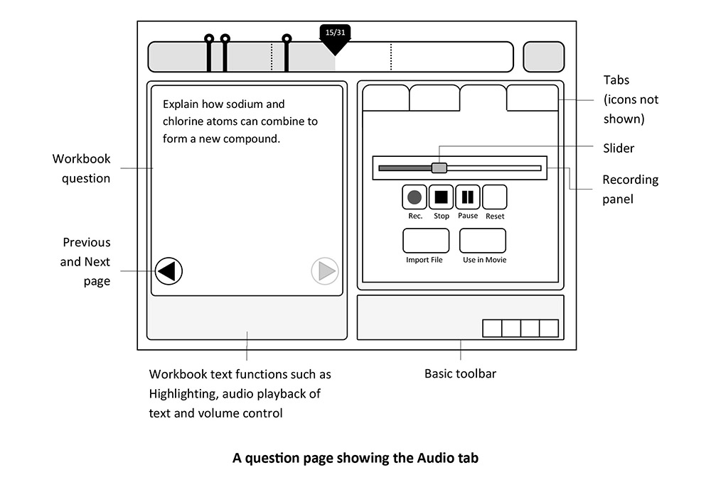
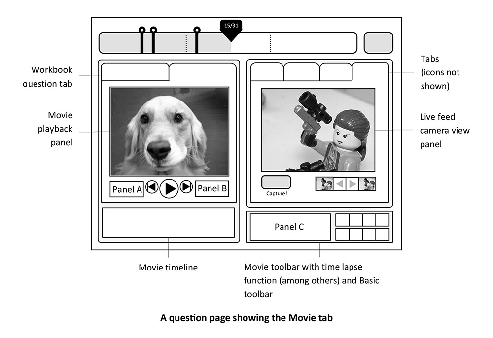
Several design elements allow me to flatten the interface and keep everything in view, thereby reducing work load:
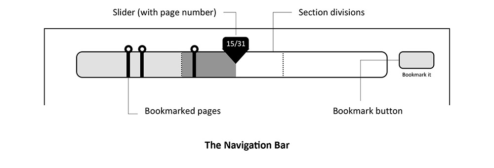
1. The navigation bar gives the student an overall look at their place in the workbook at all times.
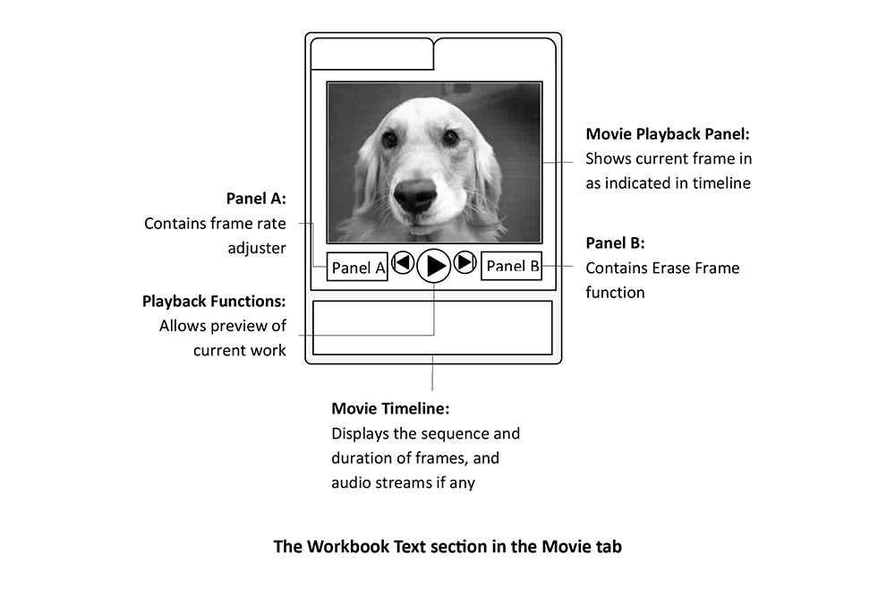
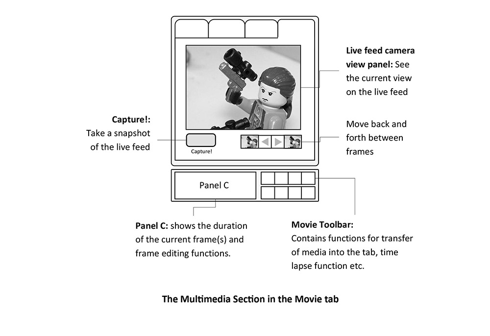
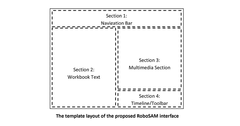
2. The design template splits the screen into halves: the left half displays informational content in standard text, while the right half displays information or receives input through multiple modalities and formats. Consistency becomes an anchor when navigating many features.
3. As no more than four non-hierarchical options are available, I found tabs to be a suitable design pattern here.
These wireframes were made in MS Word and Photoshop.
Contact Me
